5 Excel Hacks for Descriptive Statistics

In the era of data, mastering the tools that help you interpret, analyze, and visualize that data is paramount. Excel, a ubiquitous software found on almost every office computer, is an incredibly powerful tool for statistical analysis, particularly for descriptive statistics. Here are five Excel hacks that can streamline your data analysis:
1. Utilizing the Data Analysis Toolpak
Excel’s Data Analysis Toolpak is often overlooked, yet it’s a goldmine for statistical functions. Here’s how to unleash its power:
- Enable the Toolpak: Go to
File > Options > Add-Ins > Manage Excel Add-ins > Goand check the box for ‘Analysis Toolpak’. - Descriptive Statistics: Once activated, you can find it under the
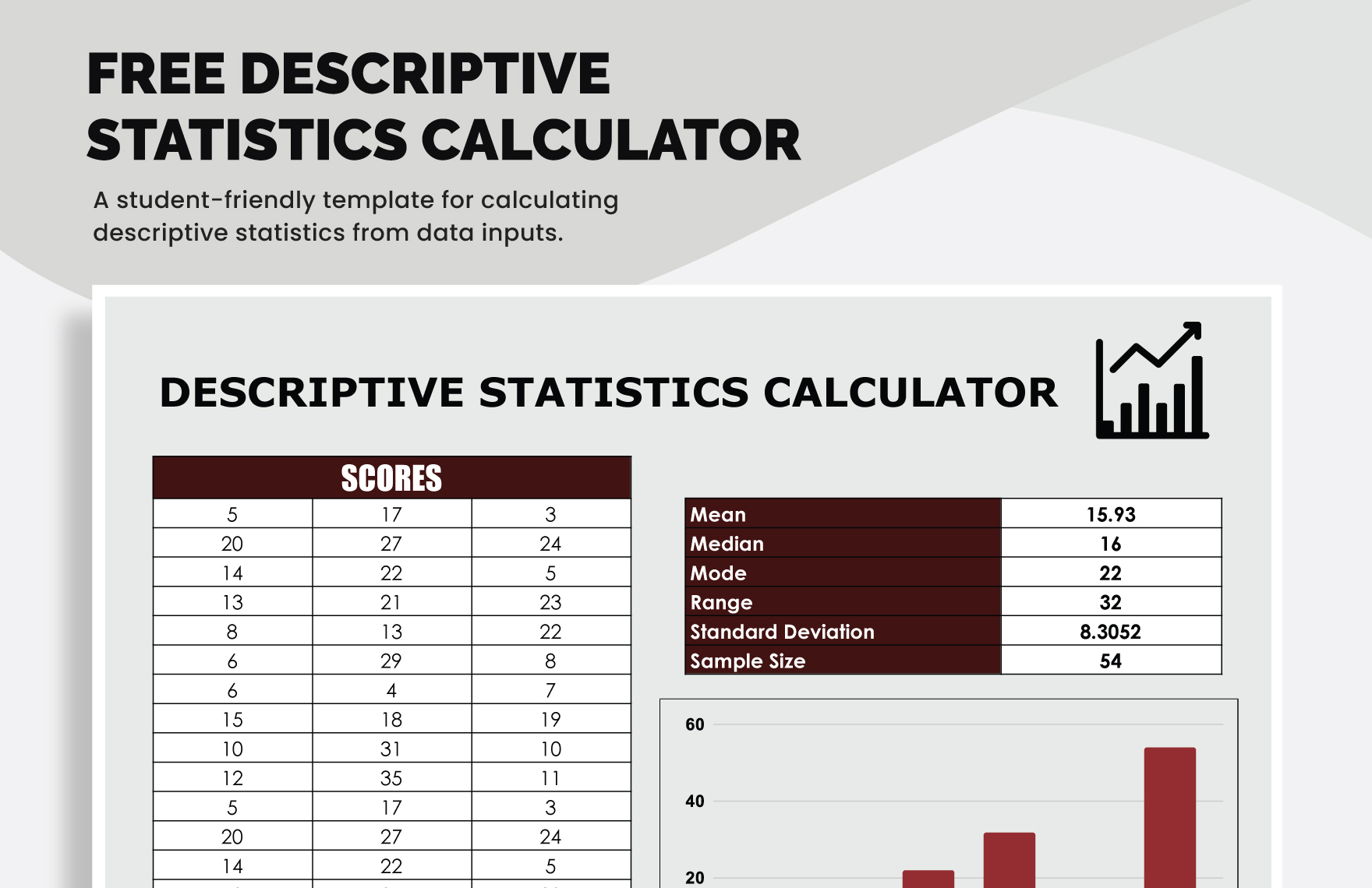
Data tab > Data Analysis. Choose ‘Descriptive Statistics’ to get a snapshot of your data: - Mean, Median, Mode
- Standard Error, Variance, Kurtosis
- Minimum, Maximum, Range, Count
🌟 Note: Ensure your data set has headings, as this helps the Toolpak recognize variables and makes interpretation easier.
2. Using Conditional Formatting for Data Insight
Excel’s conditional formatting feature can be used for:
- Highlighting trends, outliers, or specific data ranges.
- Visualizing data distribution with color scales.
To use conditional formatting for descriptive statistics:
- Select your data range.
- Go to
Home > Conditional Formatting. - Choose ‘Top/Bottom Rules’ to identify and color-code values like Top 10 or Bottom 10.
- Use ‘Data Bars’ or ‘Color Scales’ to get a visual representation of your data’s distribution.
📝 Note: Be cautious not to overuse colors which could make your spreadsheet visually noisy.
3. Speed Up Data Entry and Analysis with Flash Fill
Flash Fill can help you:
- Clean data: Format dates, separate names, or combine information quickly.
- Enhance readability: Split full names into first and last names, or reverse email addresses.
Here’s how you can use it:
- Start typing the desired outcome in an adjacent column.
- Excel will try to predict your pattern and offer to complete the rest of the column.
- Press Enter or use the
Data > Flash Filloption to accept.

| Original Data | Desired Outcome |
|---|---|
| Smith, John | John Smith |
| Doe, Jane | Jane Doe |
4. Pivot Tables for Summarizing Data
Pivot tables are Excel’s secret weapon for summarizing large data sets into descriptive statistics:
- Summarize: Easily create summaries for means, counts, sums, and percentages.
- Filter: Use slicers to dynamically filter your data for different statistical views.
Here’s how to create a Pivot Table:
- Select your data range.
- Go to
Insert > Pivot Table. - Drag and drop fields into rows, columns, or values to analyze.
💡 Note: Always ensure your data has unique identifiers or headers to avoid confusion when setting up a pivot table.
5. Automating Descriptive Statistics with VBA Macros
For those who find themselves frequently performing the same statistical analyses, automating with Visual Basic for Applications (VBA) can save time:
- Create custom functions or subroutines to automate repetitive tasks.
- Examples:
- Calculate a 5-number summary:
Min, 1st Quartile, Median, 3rd Quartile, Max - Compute common measures of spread like Standard Deviation, Variance.
- Calculate a 5-number summary:
To write a simple macro:
- Press
ALT+F11to open the VBA editor. - Insert a new module from
Insert > Module. - Write your VBA code. For example, a macro to calculate the standard deviation:
Sub CalculateStdDev()
    Dim rng As Range
    Set rng = Application.InputBox(“Select Range”, Type:=8)
    MsgBox “Standard Deviation: ” & WorksheetFunction.StDev(rng)
End Sub
In this modern data-driven world, Excel's capabilities go beyond mere spreadsheets. By leveraging these five hacks, you can transform Excel into a powerful analytical tool, enhancing your ability to perform descriptive statistics with ease and precision. These techniques not only expedite your data analysis but also provide insights in a visually appealing manner, making it easier to communicate your findings effectively. In essence, Excel becomes not just a calculation tool but a collaborator in your data journey, facilitating better decision-making and analysis at every step.
What is the Data Analysis Toolpak in Excel?
+The Data Analysis Toolpak is an Excel add-in that provides a wide range of statistical functions, including descriptive statistics, regression analysis, and more, allowing users to perform advanced data analysis without complex formulas.
How does conditional formatting help with data analysis?
+Conditional formatting visually highlights data based on specified conditions, making it easier to identify trends, outliers, or specific data points quickly, enhancing the data analysis process.
What are the benefits of using Pivot Tables?
+Pivot Tables allow you to summarize, explore, and analyze large datasets dynamically. They provide an easy way to generate cross-tabulations, calculate sums, averages, and other measures, and to filter and sort data for better insights.
Related Terms:
- how to get descriptive statistics
- descriptive statistics formula excel
- examples of descriptive statistics
- descriptive statistics calculator excel
- describe statistics in excel
- descriptive statistics in excel format


