Excel Run Chart Guide: Simple Steps for Data Analysis

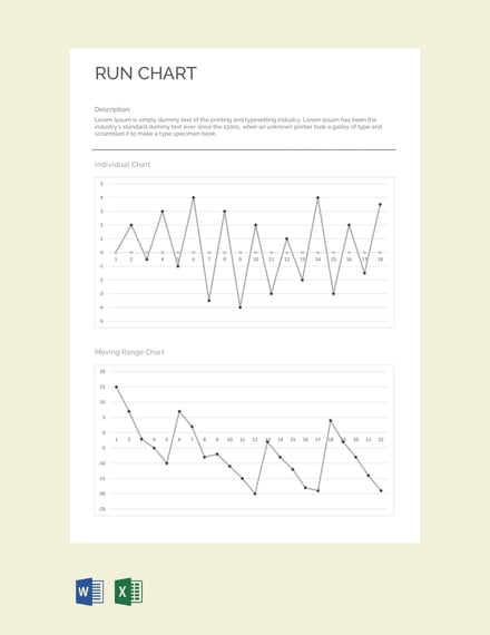
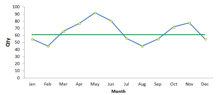
The ability to analyze data effectively can be a game changer in any field. A run chart in Excel is one of the simplest yet powerful tools to visualize trends over time, aiding in both qualitative and quantitative analysis. This guide will take you through the straightforward process of creating a run chart, highlighting its importance in data analysis and providing insights on interpreting the results.
Why Use a Run Chart?
A run chart is not just a visual representation; it’s a diagnostic tool:
- Identifying Trends: Understand if there are improvements or declines over time.
- Spotting Variations: Detect unusual or expected variations in your data.
- Analyzing Process Performance: Assess how consistent your process is.
Step-by-Step Guide to Creating a Run Chart in Excel
Collect Your Data
Before creating a run chart, ensure you have the following data points:
- Time periods (e.g., dates or sequential numbers)
- Corresponding numerical values (e.g., sales numbers, process metrics)
Here’s an example table for collecting data:

| Date | Value |
|---|---|
| 01-Jan-2023 | 120 |
| 02-Jan-2023 | 150 |
📊 Note: Ensure your data is complete and accurate for the most reliable run chart analysis.
Enter Data into Excel
Open Excel and input your data:
- Label Column A as “Date” and Column B as “Value.”
- Enter your dates or time periods in Column A.
- Enter your corresponding values in Column B.
Create the Run Chart
Now, let’s chart the data:
- Select your data range (A1:Bx, where x is the last row of data).
- Go to the “Insert” tab.
- Click on “Line” under “Charts.”
- Choose “2-D Line with Markers” or any similar line chart option.
Format Your Chart
Here’s how you can enhance your chart:
- Add Chart Title: Click on the chart, go to “Chart Elements” (the green plus sign), and add a title.
- Label Axes: Click on the axes to label time periods and values accurately.
- Customize Colors: Right-click on the line or markers to change colors for better visibility.
- Add Trend Line: You can insert a trend line to visualize overall trends.
🚨 Note: Overly customizing the chart can make it harder to read. Keep it simple for clarity.
Interpreting the Run Chart
After creating your run chart, here are some key areas to focus on:
- Trends: Look for upward, downward, or steady patterns over time.
- Patterns: Detect cycles or any repeating patterns.
- Variations: Identify significant spikes or drops that might indicate external influences.
Advanced Analysis
To take your run chart analysis further:
- Control Limits: Add upper and lower control limits to spot unusual deviations from the norm.
- Segmentation: Use conditional formatting or filters to segment data based on different criteria.
- Correlate with External Data: Look at how external events might influence your data points.
Run charts in Excel provide a simple yet powerful tool for process analysis. By following the steps above, you can effectively visualize trends, identify variations, and make informed decisions based on data patterns. Remember that the simplicity of this tool lies in its ability to make complex data understandable at a glance, enabling quick and actionable insights.
Can I use a run chart for non-time-based data?
+Yes, while run charts are commonly used for time series data, you can adapt them to analyze other sequential data points where order matters.
How often should I update my run chart?
+Regular updates, depending on the frequency of your data collection, are recommended to keep the chart reflective of the current process state.
What are control limits in a run chart?
+Control limits are statistical boundaries that help identify unusual variations in data, indicating when a process might be out of control.


