Creating a Control Chart in Excel: Beginner's Guide

Mastering the skill to visually track process stability and performance through control charts can transform the way businesses analyze and optimize their operations. Microsoft Excel, known for its robust data manipulation capabilities, offers a versatile platform for creating these essential tools in quality control. This guide will take you through the steps needed to create a control chart in Excel, highlighting the importance of such charts, and providing practical tips for beginners.
Understanding Control Charts
Control charts, also known as Shewhart charts or process-behavior charts, are statistical tools used to analyze how a process changes over time. They help in distinguishing between common cause variation and special cause variation:
- Common Cause Variation: This refers to the natural variation inherent in a stable process.
- Special Cause Variation: This indicates an unusual event or significant deviation from the process norm, requiring investigation.
The Importance of Control Charts
Control charts provide numerous benefits:
- They visually represent process performance, aiding in quick identification of trends or anomalies.
- They facilitate the monitoring of process stability, allowing for proactive adjustments.
- They foster a culture of data-driven decision-making within organizations.
Step-by-Step Guide to Creating a Control Chart in Excel
Let’s walk through the process of creating a basic control chart using Excel:
1. Prepare Your Data
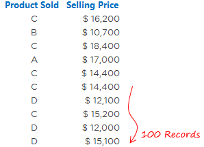
Collect the data that you want to chart. This should typically include:
- Timestamp or sequential order data point
- The measure or attribute you are tracking
Ensure your data is in chronological order in two columns.
2. Calculate Control Limits
Control limits are critical for defining the boundaries of process stability:
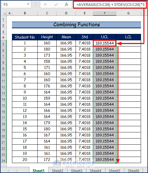
- Upper Control Limit (UCL): Mean + (3 * Standard Deviation)
- Lower Control Limit (LCL): Mean - (3 * Standard Deviation)
Here's how to compute these in Excel:

| Step | Excel Formula |
|---|---|
| Calculate the Mean | =AVERAGE(B2:B101) |
| Calculate the Standard Deviation | =STDEV.P(B2:B101) |
| Upper Control Limit | =Mean + 3*Standard_Deviation |
| Lower Control Limit | =Mean - 3*Standard_Deviation |
⚠️ Note: Replace B2:B101 with your actual data range.
3. Plot the Data and Control Limits
Now, plot your data and the calculated control limits:
- Select the column with your data and insert a Line chart.
- Right-click on the chart, choose Select Data, and add three new series for Mean, UCL, and LCL. Use the calculated values for each.
- Customize the chart by changing the line color and style for better visibility.
4. Interpret the Control Chart
After creating your chart, analyze it for the following:
- Trends: Look for consistent movements towards one limit.
- Patterns: Check for recurring fluctuations or cycles.
- Points Beyond Limits: Identify any points outside of the control limits, signaling special cause variation.
Practical Tips for Enhancing Your Control Chart
- Automate Calculations: Use Excel’s named ranges or define formulas in a separate column for dynamic updates.
- Adding Annotations: Annotate points of significance to provide context or explanations for unusual data points.
- Time-based Data: Consider using time on the x-axis for better interpretation of process changes over time.
- Set Up Alerts: Conditional formatting can alert you to data breaches or anomalies.
By following this guide, you've now got the tools and knowledge to create a basic control chart in Excel. This chart allows you to monitor and control processes, spot trends, and react proactively to deviations, leading to improved process quality and efficiency.
What is the difference between common cause and special cause variation?
+
Common Cause Variation refers to the natural, inherent variability in a process due to the combined effect of many small, random influences. Special Cause Variation, however, is due to assignable causes that can be traced to specific events or circumstances outside the standard operating conditions.
Can control charts help in predicting future process performance?
+
Control charts can help predict future performance to some extent by monitoring trends, shifts, or patterns in the process. However, predicting process behavior accurately requires careful interpretation of these charts alongside other predictive analytics tools.
Why should I use Excel for creating control charts?
+
Excel is user-friendly and widely available, making it an accessible tool for creating control charts. It offers robust data manipulation capabilities, straightforward chart creation, and the option to customize charts for professional reporting and analysis.


