Excel Run Chart Guide: Simple Steps to Visualize Data
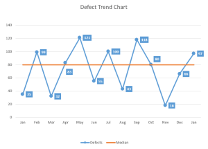
Creating a run chart in Excel can help you visualize how data changes over time, making it a powerful tool for identifying trends, variations, and stability in your data. Whether you're tracking sales performance, monitoring project progress, or analyzing any time-series data, a run chart provides an intuitive way to see changes at a glance.
Why Use a Run Chart?
- Identify Trends: See if your data is moving upwards, downwards, or remaining constant over time.
- Spot Variations: Highlight unusual data points or shifts which might indicate a problem or an opportunity.
- Process Stability: Determine if the process under observation is stable or requires adjustments.
Step-by-Step Guide to Creating a Run Chart in Excel
1. Gather Your Data
Before you start, make sure you have:
- Time-Series Data: Dates or time intervals on the x-axis.
- Values: The data you’re observing, placed on the y-axis.
2. Prepare Your Excel Spreadsheet
Organize your data into columns:
| Column A | Column B |
|---|---|
| Date | Value |
| 1-Jan | 100 |
| 2-Jan | 110 |
Fill in your data accordingly.
3. Set Up the Run Chart
- Select Your Data: Click and drag to select the range containing your dates and values.
- Insert a Line Chart: Go to the “Insert” tab, click on “Line,” then choose the first option under “2-D Line”.
- Customize the Chart:
- Add a chart title, axis titles, and adjust the scale if necessary.
- Right-click on the chart to change the chart type to a Scatter with Smooth Lines for smoother transitions between data points.
4. Analyze the Run Chart
Once your run chart is created, you can begin analysis:
- Look for patterns or trends. Is there an upward or downward trend?
- Check for outliers or any unusual spikes or drops.
- Identify shifts, where there’s a sustained change in the level of the data.
📌 Note: While run charts show how data changes over time, they don’t indicate causation or statistical significance.
Enhancing Your Run Chart
You can improve your run chart to provide more insights:
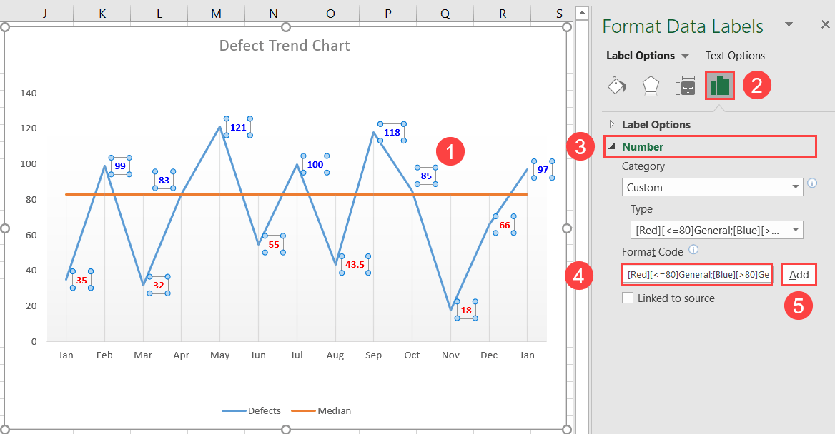
- Add Averages: Insert a horizontal line for the mean or median to see where your data falls relative to average performance.
- Annotate Key Points: Use text boxes or shapes to highlight significant events or changes.
- Color Coding: Apply different colors for different data series or to indicate different phases or conditions.
- Control Limits: Calculate and add upper and lower control limits to gauge process variability.
Automating Run Chart Creation
If you regularly update your run chart, consider automating it with Excel:
- Create dynamic charts using Excel’s built-in functions like OFFSET and COUNTA for charts that automatically update when new data is entered.
- Use VBA macros to create charts based on conditions or to automate data entry and chart creation.
Interpreting the Run Chart
Here’s how to get the most out of your run chart:
- Analyze the trend line for overall movement.
- Identify cycles or patterns.
- Observe points outside the expected range for further investigation.
📌 Note: Patterns like runs (seven or more points in a row above or below the median) or shifts (seven or more points in a row increasing or decreasing) can indicate process changes or problems.
From tracking daily sales to monitoring project deadlines, the insights gained from run charts can inform decision-making, highlight areas for improvement, and demonstrate progress over time. When used correctly, they serve as a visual snapshot of data's performance, aiding in data-driven decision-making across various business functions. By following the steps outlined above and utilizing Excel's powerful tools, you can make the most of run charts to improve your data analysis capabilities.
Can I use run charts for non-time-series data?
+While run charts are primarily designed for time-series data, you can adapt them to represent ordered data or sequential events. However, the interpretation might differ from the traditional time-based analysis.
How often should I update my run chart?
+It depends on your data frequency. For daily metrics, update daily. For weekly or monthly metrics, update accordingly to reflect the most recent data points and maintain relevancy.
Are there any other tools I can use to create run charts?
+Yes, several software applications offer run chart capabilities including Minitab, JMP, QI Macros for Excel, and even some free tools like Google Sheets. Each has its own set of features for chart customization and analysis.
What if my data shows many outliers?
+First, validate the outliers for accuracy. If they’re correct, they might indicate special causes of variation. Consider whether they’re significant or if the process should be adjusted to reduce variability.
Can a run chart help in quality control?
+Yes, run charts are excellent for monitoring quality metrics over time, helping identify when a process might be going out of control or when there’s an opportunity for improvement.
