5 Easy Steps for Box and Whisker Plots in Excel

Box and Whisker plots, often known as Box Plots, are statistical diagrams that display the distribution of a dataset based on its quartiles. This graphical representation helps in understanding the spread and skew of the data, identifying outliers, and comparing datasets. Excel, while not traditionally the first choice for such advanced statistical visualization, can indeed create Box and Whisker plots with a bit of guidance. Here's how you can master this functionality in just five easy steps:
Step 1: Organize Your Data
Before creating a Box Plot, ensure your data is organized:
- Column of Data: Ensure your data is in a single column. If you have multiple datasets, you’ll need multiple columns.
- Sort Data: Though not required, sorting the data from lowest to highest can help in understanding the plot better.
🌟 Note: Sorting isn’t mandatory but makes the visualization of data more intuitive.
Step 2: Calculate Summary Statistics
Box Plots require several statistical measures:
- Minimum: The smallest data point in your dataset.
- First Quartile (Q1): The value below which 25% of the data lies.
- Median (Q2): The middle value or the average of the two middle values if the number of data points is even.
- Third Quartile (Q3): The value below which 75% of the data lies.
- Maximum: The largest data point in your dataset.
- Interquartile Range (IQR): Q3 - Q1, which helps in defining outliers.

| Measure | Excel Function |
|---|---|
| Minimum | =MIN(A1:A20) |
| Q1 | =QUARTILE.EXC(A1:A20, 1) |
| Median | =MEDIAN(A1:A20) |
| Q3 | =QUARTILE.EXC(A1:A20, 3) |
| Maximum | =MAX(A1:A20) |
| IQR | =Q3 - Q1 |
🔍 Note: Excel 2016 and later versions use QUARTILE.EXC for exclusive quartiles, while older versions might use QUARTILE.INC or QUARTILE.
Step 3: Create the Box Plot
Here’s how to craft your Box Plot:
- Highlight the calculated statistics from Step 2.
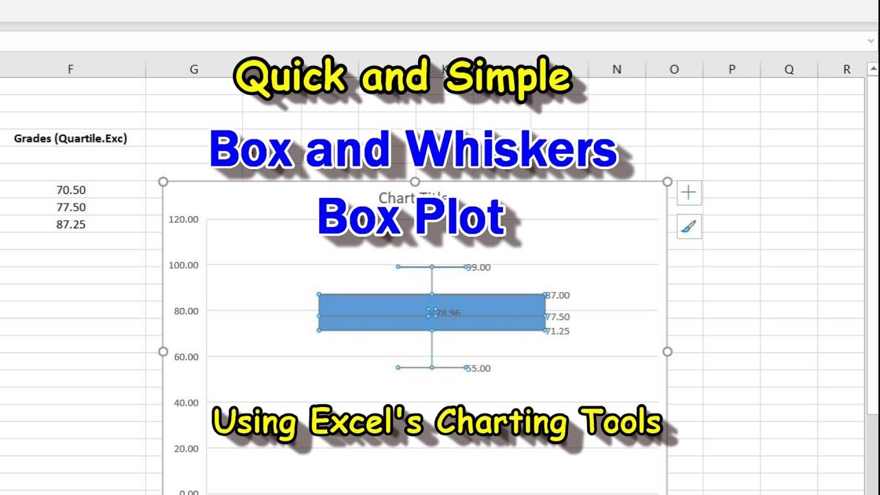
- Navigate to Insert > Chart, then choose Box and Whisker. In older versions of Excel, you might need to insert a series of columns with these values and then manually set up a stacked column chart to simulate a Box Plot.
Step 4: Customize Your Plot
Enhance the Box Plot:
- Colors: Change the color of the box, whiskers, and outliers for better visibility or to align with your presentation theme.
- Axis: Adjust the axis scales to better fit your data range.
- Outliers: If any, these should appear as individual points.
- Labels: Add labels to the axes and if needed, for outliers.
🎨 Note: Customizing the chart makes it more professional and user-friendly.
Step 5: Analyze and Interpret
Interpreting the Box and Whisker Plot:
- Box: The box represents the middle 50% of the data, from Q1 to Q3.
- Whiskers: These extend from the box to the smallest and largest value that is not an outlier.
- Median: The line or dot inside the box indicates the median.
- Outliers: Points outside of the whiskers.
- Compare the lengths of boxes and whiskers to understand variability and skewness.
- Check for symmetry or asymmetry in the plot to detect distribution characteristics.
With these steps, you can effectively create, customize, and interpret a Box and Whisker Plot in Excel. This plot not only showcases the distribution of your data but also aids in making data-driven decisions by visually highlighting key statistical points. Remember, the visualization is as much about presenting data as it is about telling a story through numbers, making complex data accessible to everyone. Let's explore a few frequently asked questions to deepen our understanding:
Can I create a Box Plot without the built-in feature in older Excel versions?
+
Yes, older versions of Excel can simulate Box Plots using a stacked column chart. You’ll need to manually plot each part of the Box Plot: whiskers, the box, and any outliers, by calculating and inserting the necessary values into separate columns.
How do I handle missing or incomplete data in a Box Plot?
+
Excel automatically excludes blank cells when calculating statistics. However, ensure you check your data source for any missing entries which might skew your results. For a more comprehensive approach, consider manually removing or estimating missing values before plotting.
What does a Box Plot tell us about data distribution?
+
A Box Plot provides a quick visual summary of the dataset’s distribution, including:
- The central tendency (median)
- Dispersion (IQR, range)
- Symmetry (by comparing the box’s sides)
- Presence of outliers (points outside whiskers)
Can I create Box Plots for categorical data?
+
Yes, if you have numerical data for different categories, you can create side-by-side Box Plots. Each category would have its own Box Plot, allowing for easy comparison across groups.


